Enabling Patients to Manage Notifications
Cedar’s mission is to reduce complexity and confusion around the patient billing experience. A core aspect of billing is getting notified of new or outstanding bills that require patient action. This project is my story of building the first iteration of a notification center that empowers the patient to manage settings while reducing additional provider action.
Cedar’s mission is to reduce complexity and confusion around the patient billing experience. A core aspect of billing is getting notified of new or outstanding bills that require patient action. This project is my story of building the first iteration of a notification center that empowers the patient to manage settings while reducing additional provider action.
Cedar’s mission is to reduce complexity and confusion around the patient billing experience. A core aspect of billing is getting notified of new or outstanding bills that require patient action. This project is my story of building the first iteration of a notification center that empowers the patient to manage settings while reducing additional provider action.
Cedar’s mission is to reduce complexity and confusion around the patient billing experience. A core aspect of billing is getting notified of new or outstanding bills that require patient action. This project is my story of building the first iteration of a notification center that empowers the patient to manage settings while reducing additional provider action.
ROLE
Freelance Product Designer
TEAM
Alex Zhang — Product Manager
STATUS
Launched December 2017. Learn more at cedar.com
GOAL
PROBLEM
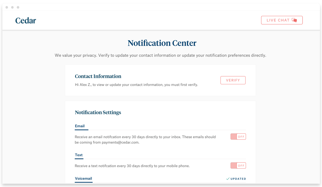
Empower patients to manage their notifications
As Cedar continues to onboard more providers onto their platform, this means more patients will be using the product to review, pay, and manage their bills from their visits. Notifications are the primary way to bring patients to Cedar to pay their bills. The goal was to build the foundation of a notification center that patients can efficiently manage their preferences.
CHALLENGES & RISKS
Enabling The Right Choices
With the most recent provider rollout, the team started to see issues arising from the lack of ability to adjust how to get notified. Instead of doing one-off changes to manage notifications or having providers reverting to paper statements, the team needed a solution to empower patients to manage their preferences on their own. And thus, we needed to keep in mind:
- Reduce call & chat volume from patients requesting to be opted out of notifications to providers.
- Eliminating cases of customers notified after they requested to be opted out.
- Allow provider reps to modify patient notification settings on their behalf.
- Most importantly, not encourage patients to opt out of digital communications.
CONTEXT
Cedar's Notification Experience Today
Cedar's Notification Experience Today
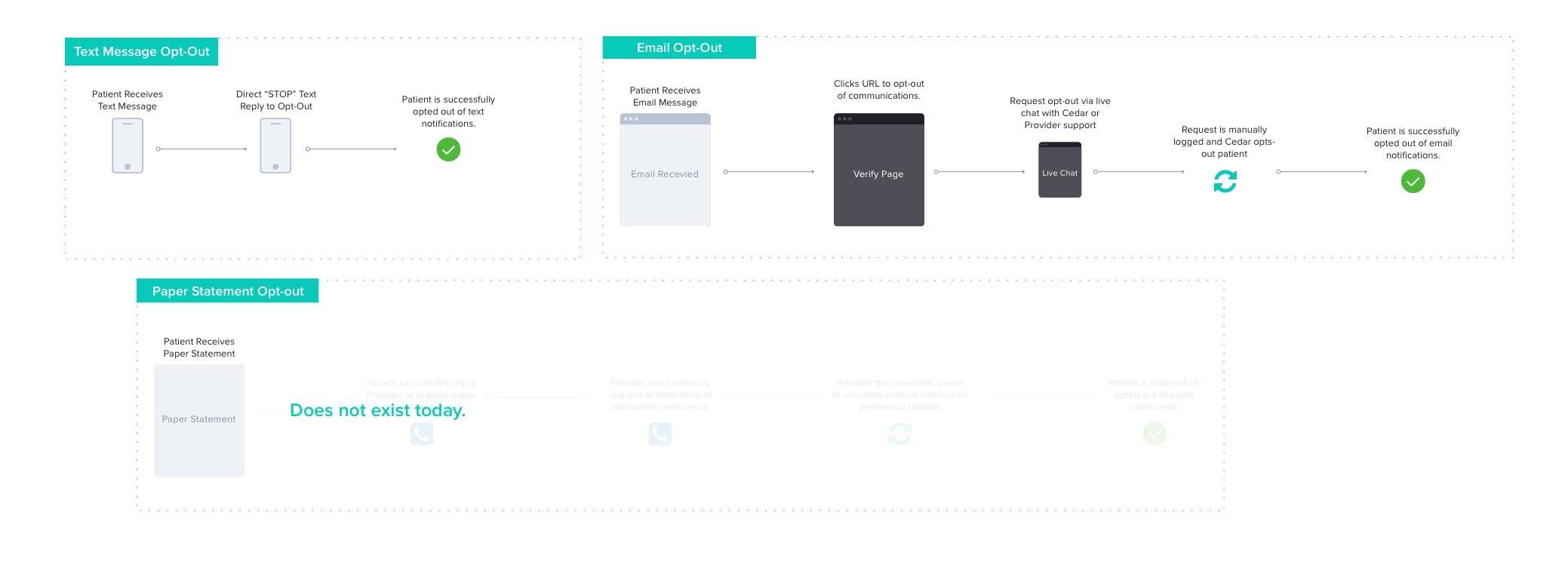
There are 4 main ways a patient gets notified of a bill today:
By text message via a mobile phone number that the patient has given to a provider.
By phone call via mobile or home phone number that the patient has given to a provider.
By email via the email address that the patient has given to a provider.
Or, by paper statement via the address that the patient has given to the provider.
Or, by paper statement via the address that the patient has given to the provider.
In the existing experience, there is no way to opt out of paper statements. However, patients can opt out of digital communications in a variety of ways:
By text message, after receiving a text message notification, the text message asks if the patient would like to opt-out, to reply “STOP” directly for an immediate opt-out. No human interaction.
By unsubscribing via URL, in an email message, with a one-click unsubscribe. By clicking the URL, it takes you to a landing page that acknowledges you are opting out of emails. No human interaction.
By unsubscribing via URL, in an email message, with a one-click unsubscribe. By clicking the URL, it takes you to a landing page that acknowledges you are opting out of emails. No human interaction.
By live chat, where patients click to their Verify page and ask to be removed. Directly to the provider.
Or patients calling their providers directly to manage or opt out. Directly to the provider.
Good Opt-Out Examples
Good Opt-Out Examples
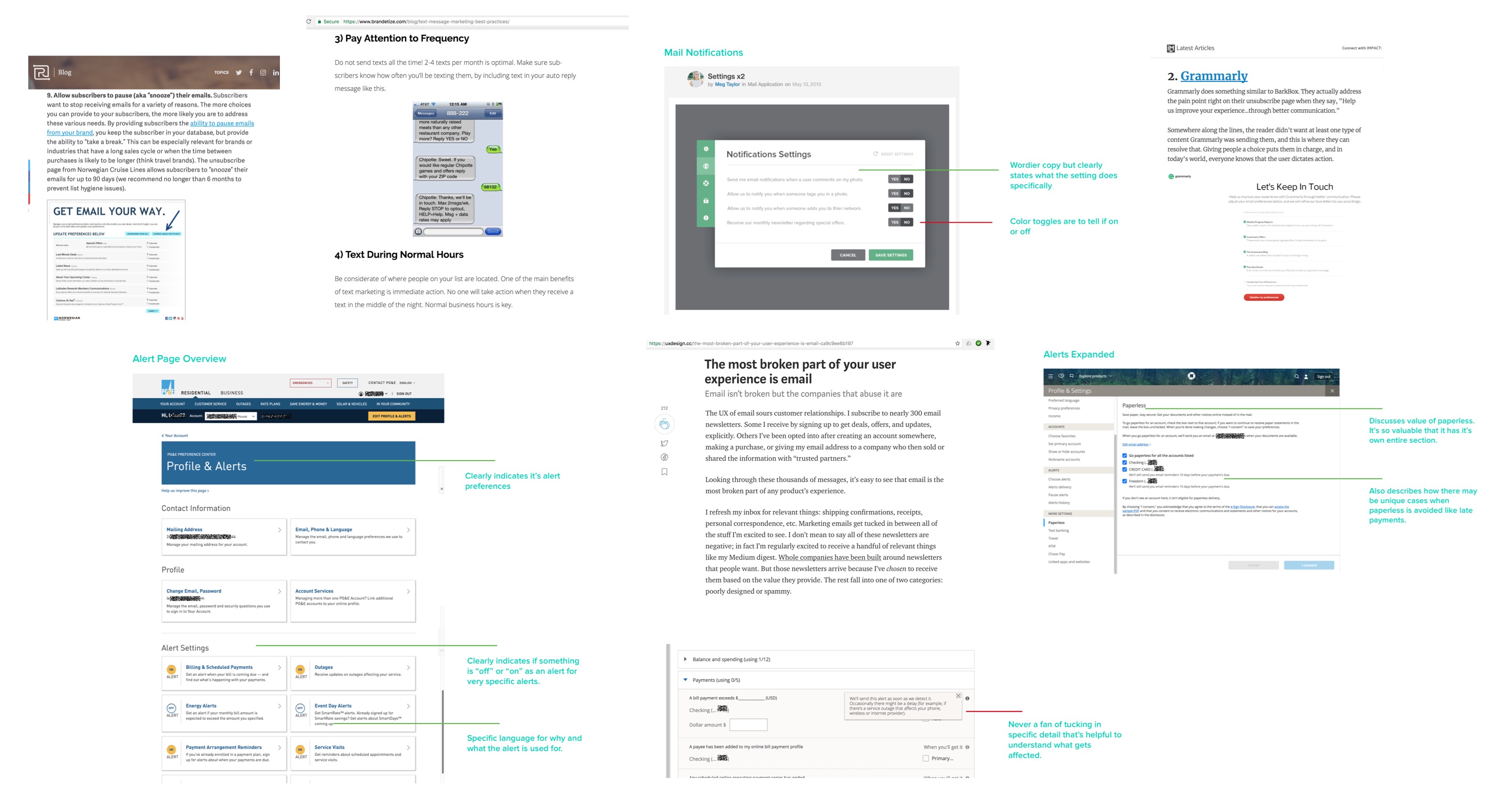
Notification centers aren’t a new concept. Looking at other examples allowed us to get to a solution faster by understanding what works and what doesn’t. This included readings on how to handle email opt-outs, how energy and credit card companies handled notifications and other UI experiences.
Notification centers aren’t a new concept. Looking at other examples allowed us to get to a solution faster by understanding what works and what doesn’t. This included readings on how to handle email opt-outs, how energy and credit card companies handled notifications and other UI experiences.
Notification centers aren’t a new concept. Looking at other examples allowed us to get to a solution faster by understanding what works and what doesn’t. This included readings on how to handle email opt-outs, how energy and credit card companies handled notifications and other UI experiences.
Notification centers aren’t a new concept. Looking at other examples allowed us to get to a solution faster by understanding what works and what doesn’t. This included readings on how to handle email opt-outs, how energy and credit card companies handled notifications and other UI experiences.
Notification centers aren’t a new concept. Looking at other examples allowed us to get to a solution faster by understanding what works and what doesn’t. This included readings on how to handle email opt-outs, how energy and credit card companies handled notifications and other UI experiences.
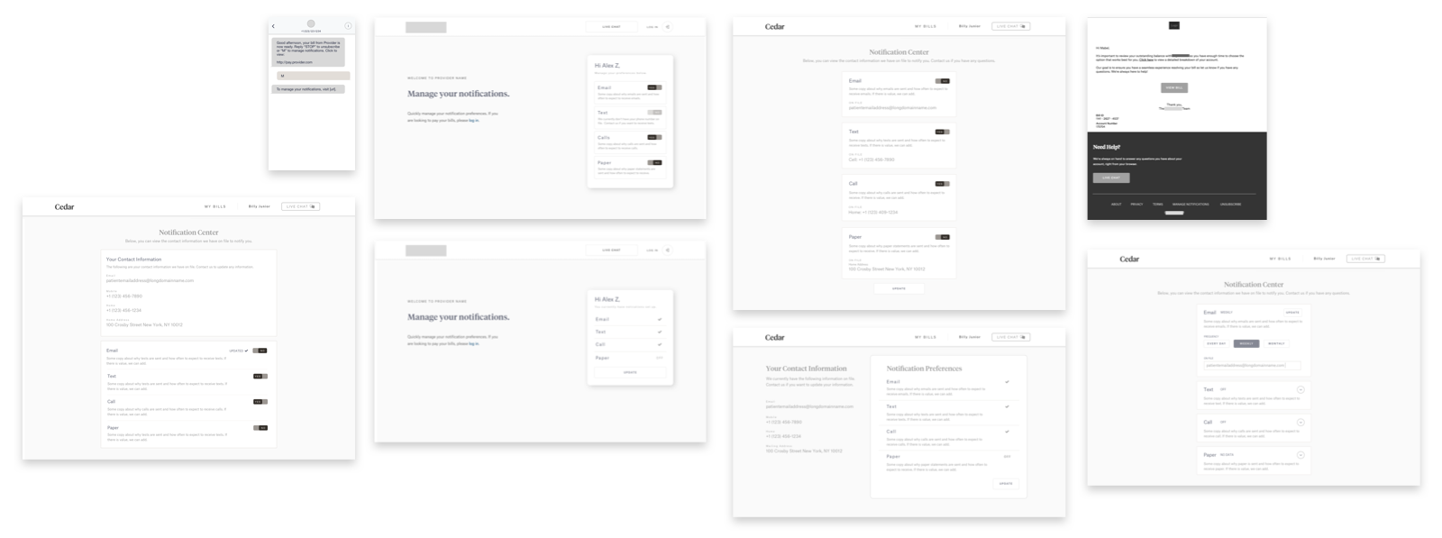
BRAINSTORM & WIREFRAME
Iterate & Iterate
Iterate & Iterate
Iterate & Iterate
Before diving into wireframes, there were several journeys that the team had to consider. Each experience required different views. That was, what it meant to opt out of: emails, text message, and directly on the Cedar patient app whether that is signed in or signed out. These also helped us map what features we needed for MVP.
Before diving into wireframes, there were several journeys that the team had to consider. Each experience required different views. That was, what it meant to opt out of: emails, text message, and directly on the Cedar patient app whether that is signed in or signed out. These also helped us map what features we needed for MVP.
Before diving into wireframes, there were several journeys that the team had to consider. Each experience required different views. That was, what it meant to opt out of: emails, text message, and directly on the Cedar patient app whether that is signed in or signed out. These also helped us map what features we needed for MVP.
Before diving into wireframes, there were several journeys that the team had to consider. Each experience required different views. That was, what it meant to opt out of: emails, text message, and directly on the Cedar patient app whether that is signed in or signed out. These also helped us map what features we needed for MVP.
Before diving into wireframes, there were several journeys that the team had to consider. Each experience required different views. That was, what it meant to opt out of: emails, text message, and directly on the Cedar patient app whether that is signed in or signed out. These also helped us map what features we needed for MVP.
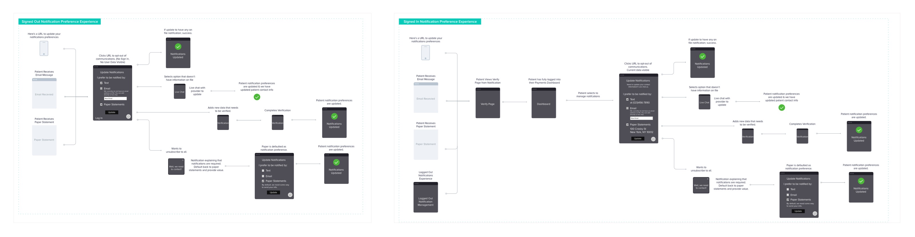
We also tried various ways to present the information. These included checkboxes versus toggles, centered vs. left alignment, one vs. two column approach, and different ways to communicate via copy.
Ultimately, we wanted something that could work signed in and signed out thinking about the future of this notification center where we also allow patients to update their personal information instead of just opt in and out.
FINAL SOLUTION
Adaptable Design
The solution was creating an interchangeable design that worked for both the signed in and signed out experience. That is, depending on the state:
- We can show or hide any patient data to protect privacy.
- We provide feedback and auto-save when a setting is updated.
- We indicate that there is missing contact information to encourage updated information.
- Ultimately to create a default state that explains the limitations of full opt-out.
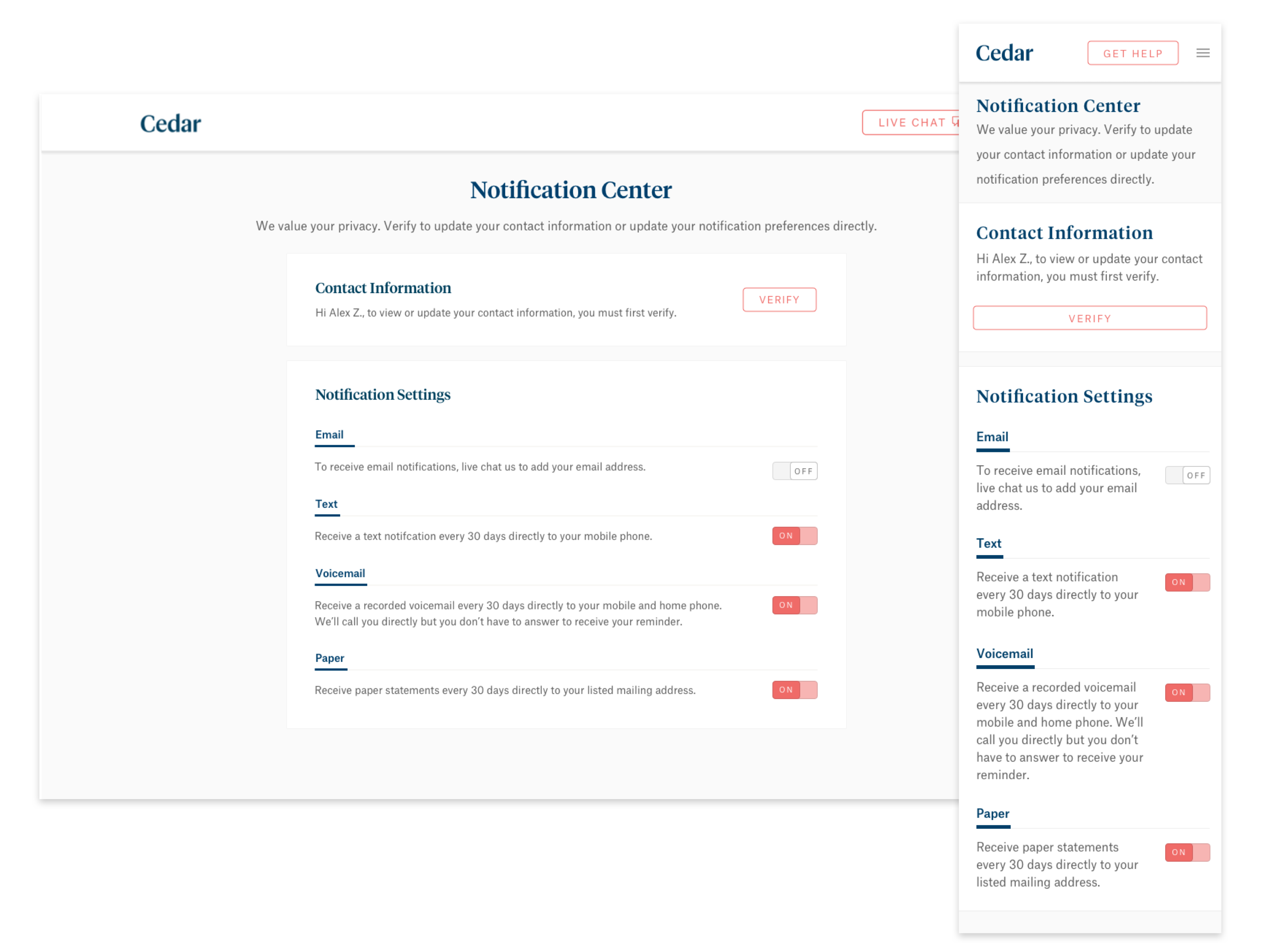
Thinking ahead, we also wanted this design to grow. In the future, if editing patient information is possible, we wanted the ability to do so without redesigning the entire interface. This version (Signed In) allows us to do inline editing in the future without compromising the UI.
Thinking ahead, we also wanted this design to grow. In the future, if editing patient information is possible, we wanted the ability to do so without redesigning the entire interface. This version (Signed In) allows us to do inline editing in the future without compromising the UI.
Thinking ahead, we also wanted this design to grow. In the future, if editing patient information is possible, we wanted the ability to do so without redesigning the entire interface. This version (Signed In) allows us to do inline editing in the future without compromising the UI.
Thinking ahead, we also wanted this design to grow. In the future, if editing patient information is possible, we wanted the ability to do so without redesigning the entire interface. This version (Signed In) allows us to do inline editing in the future without compromising the UI.
While a mobile app isn't the core focus at the moment, folks may be coming from a mobile phone. We wanted a seamless, responsive design.
While a mobile app isn't the core focus at the moment, folks may be coming from a mobile phone. We wanted a seamless, responsive design.
While a mobile app isn't the core focus at the moment, folks may be coming from a mobile phone. We wanted a seamless, responsive design.
While a mobile app isn't the core focus at the moment, folks may be coming from a mobile phone. We wanted a seamless, responsive design.
While a mobile app isn't the core focus at the moment, folks may be coming from a mobile phone. We wanted a seamless, responsive design.
STATUS & RESULTS
Project Launched
Project Launched
The notification center launched to the same pilot group in December 2017. Since then, the experience has allowed both patients and provider reps to directly manage notification settings. There has been a reduction in requests to the Cedar team directly. Overall, we’ve received a positive reception.
REFLECTIONS
With a health-specific product, there are a lot of things you can and cannot do. I think constraints are great because it forces you to be creative while focusing on your core goals. This was one of those projects that while yes, I am designing a product that handles sensitive patient data, we're ultimately designing for functionality.
I love the fact that everyone has a different take on how to solve a problem. It doesn’t matter to find the perfect solution but to learn as much as possible every step of the way.